Coat of arms and logo for Innopolis
We created this work for the visual identity contest for Innopolis. Innopolis is a hi-tech industry town in Russia. Written by Eugene Arutyunov.
* * *
The coat of arms for a young town should be simple. It is fine if it has only one symbol instead of complex construction. The coat of arms of a hi-tech town like Innopolis, must demonstrate one main idea of high technology.
The traditional metaphors for hi-tech are the qualities and parts of digital data and devices. Modules, discreetness and centralized processes. Parts of screens, contacts on a board, pixels, “zeros and ones”.
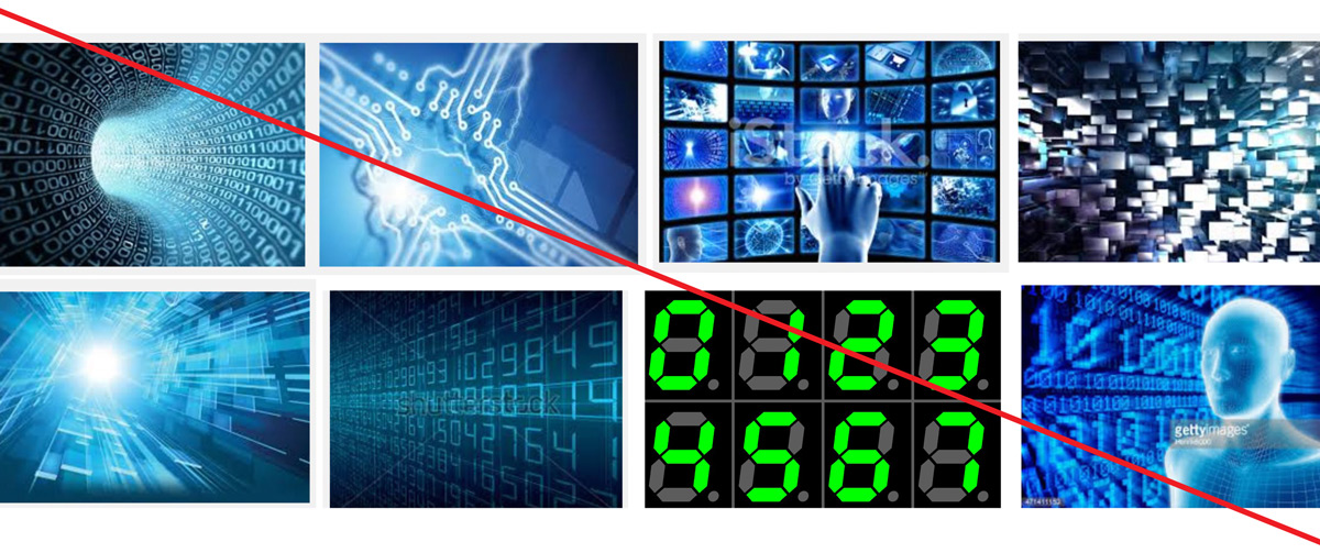
These metaphors are outdated.
Hi-tech of the near future is most likely associated with fluency, consistency, continuity, and distributed information. In a sense, the future is already here – retina screens are so crisp that you cannot see the pixels and discretion of modern digital audio is impossible to hear.

We are waiting for some “smart materials” and neural networks to replace centralized architecture. That’s where we decided to look for metaphors.
Traditionally, modern objects are not used in the armory. We do not see many coats of arms with processors, robot hands or pieces of program code. We suggest a nerve cell, a neuron to become a universal symbol of hi-tech:

It is a base information conductor. At the same time, it is a thing that is much spoken of in the modern hi-tech industry. And it will never be out-of-date as the technology will have to deal with our neurons anyway. Neurons are old enough to be appropriate for the armory.
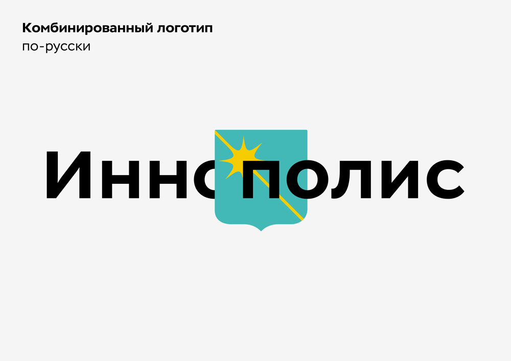
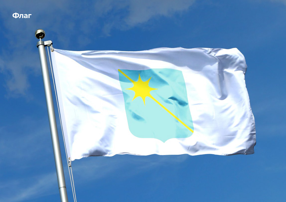
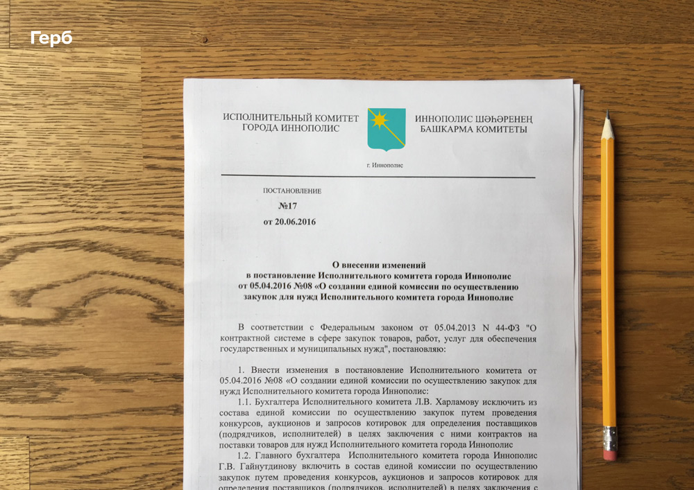
The coat of arms is rectangular, round-cornered with a cusp point at the bottom. It is an azure heraldic shield with a gold symbol of a neuron. The core of it is in the upper left corner and the axon points to the bottom right corner:
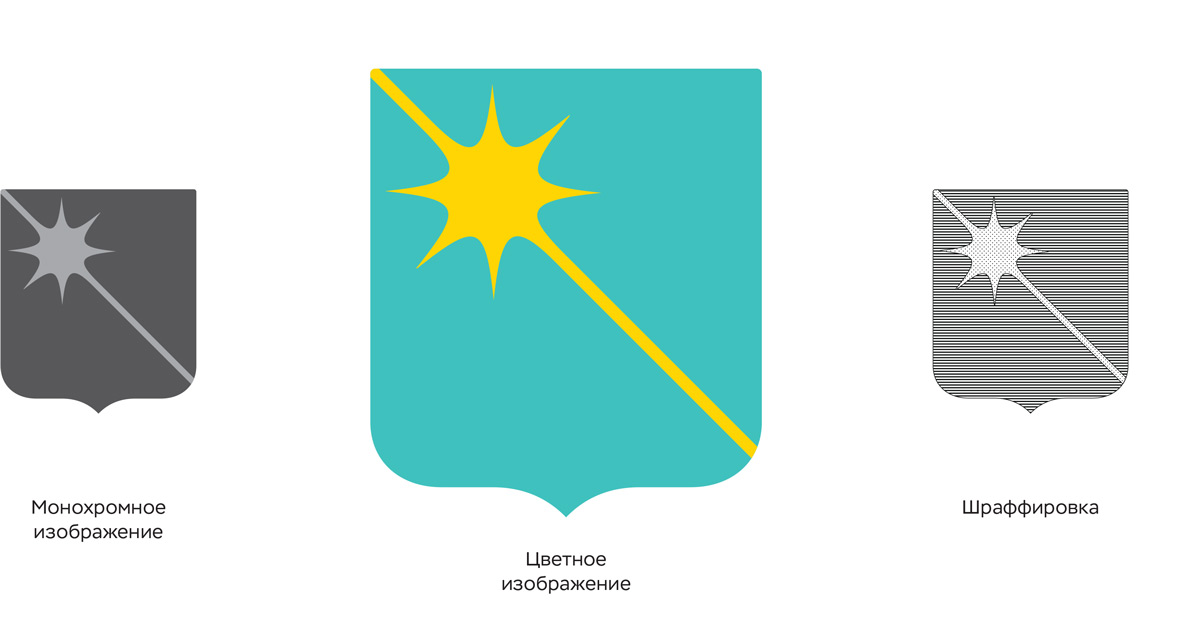
The shield has a French shape, which is common for Russian cities. If the coat of arms were more complex and had more details, we could make it of any shape, including round. But a simple picture won’t look like a coat of arms:

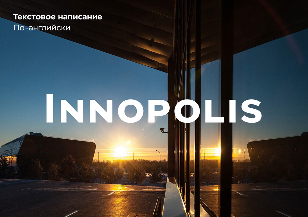
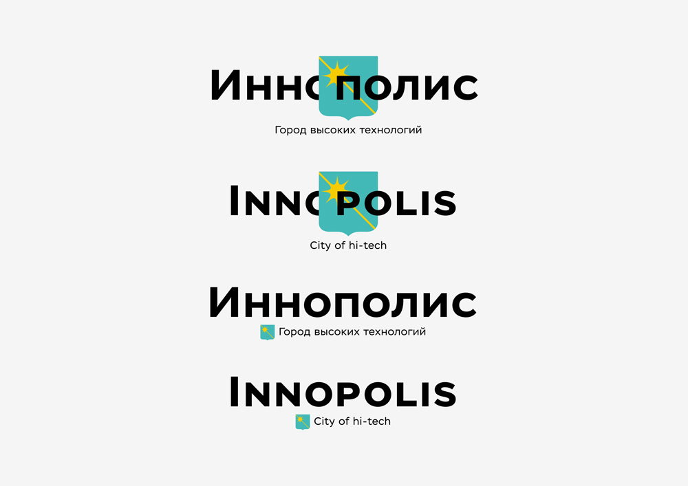
The logo is the town name typed in Stem Text. Usually, the main thing in any text is lower-case, but we decided that the upper-case will look better here. Actually, it is not upper-case, it is small caps:

It is easy to put letters without lower elements on a surface. Letters N and L look more different than n and l, so they are easier to read. In Russian, lower and upper case for these letters are the same, but small caps look larger and tighter.
