Logo and site for Logeksim
Logeksim is a logistic company that ships mainly from Turkey to Russia. It has been working for a long time and helps its clients to find suppliers, works as a partner in negotiation, bears full financial responsibility for cargo.
The new logo inherits the characteristics of the old one, corrects imperfections and makes it recognizable. The logo now has two versions – Turkish and Russian.
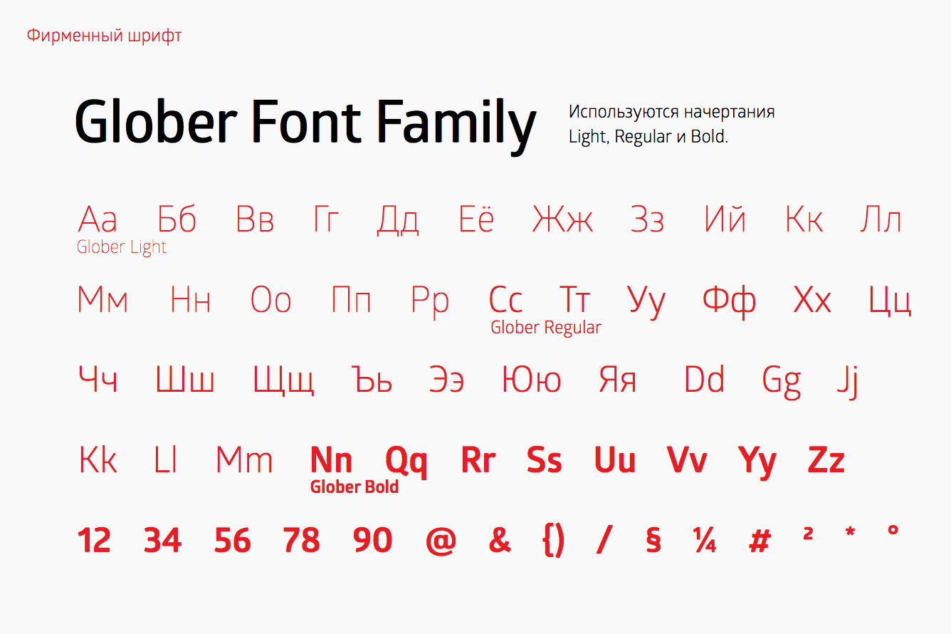
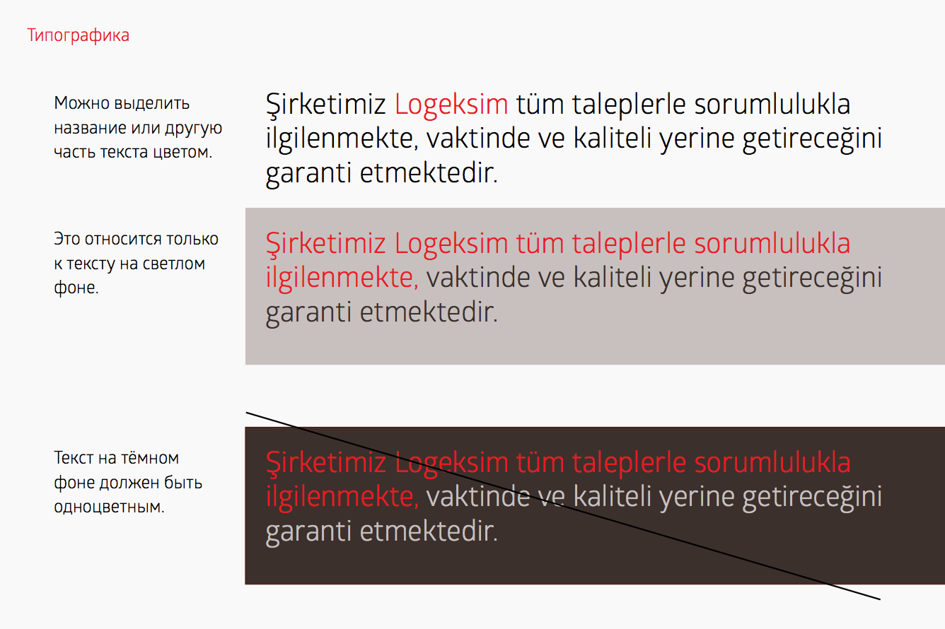
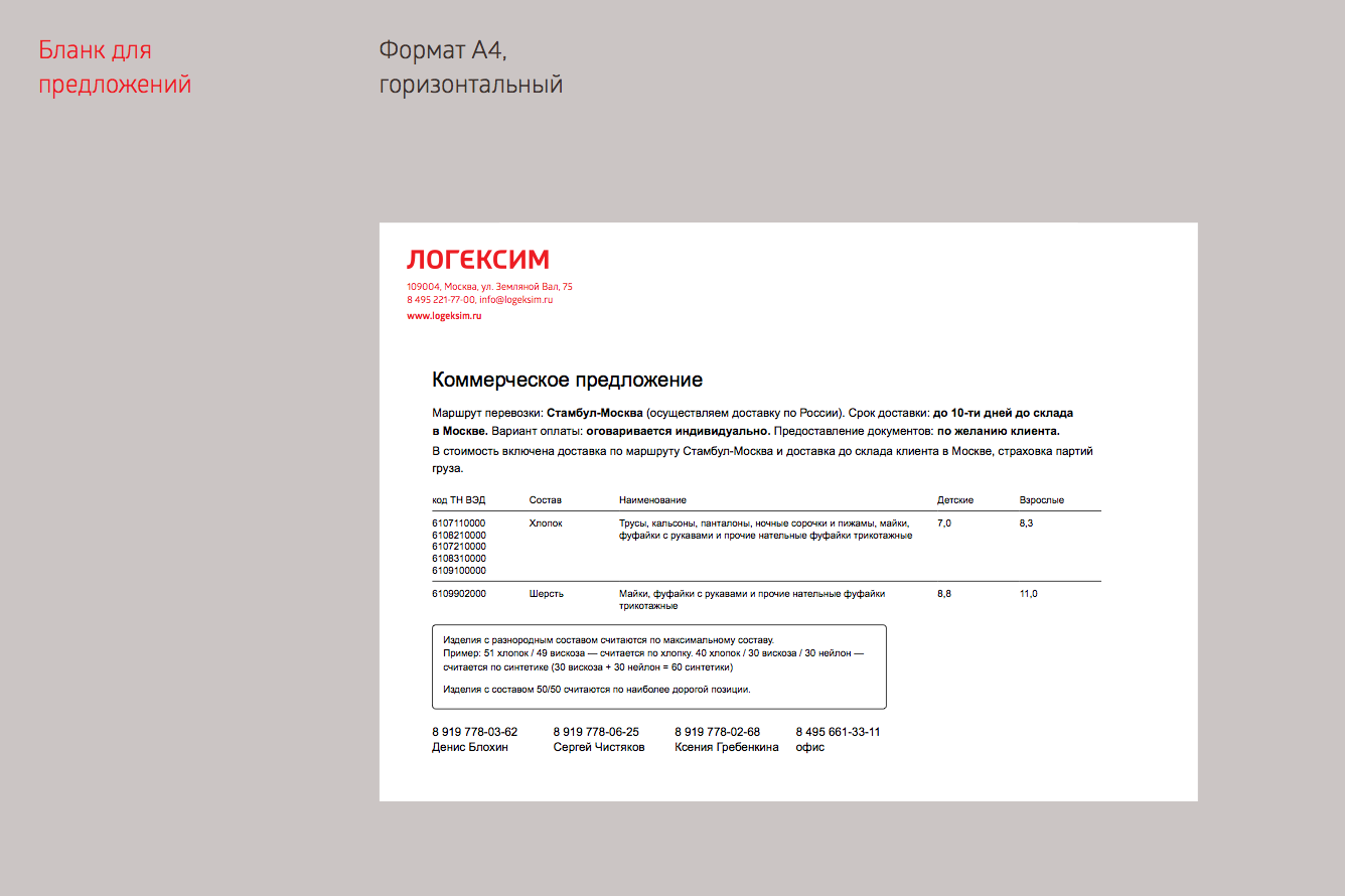
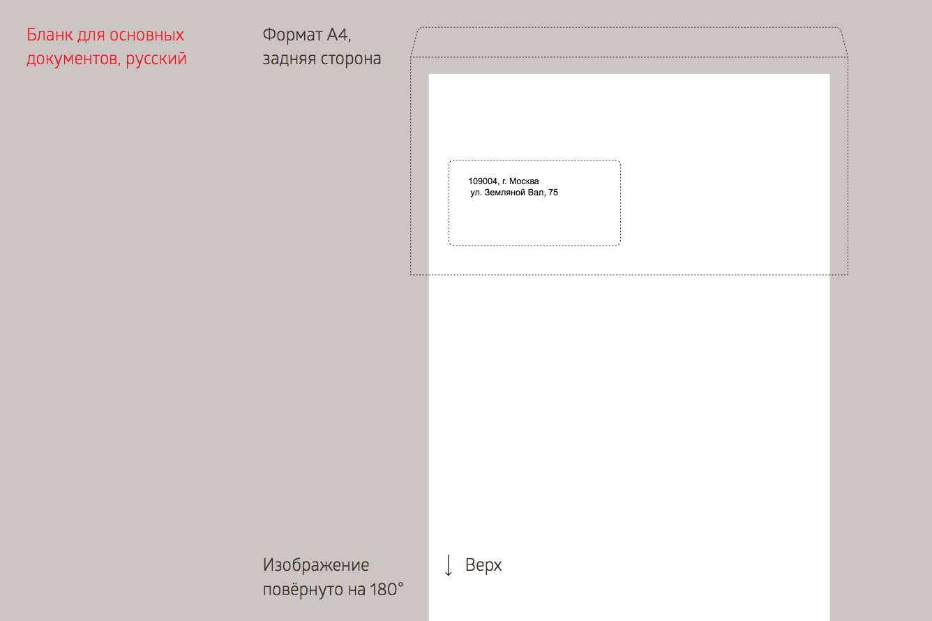
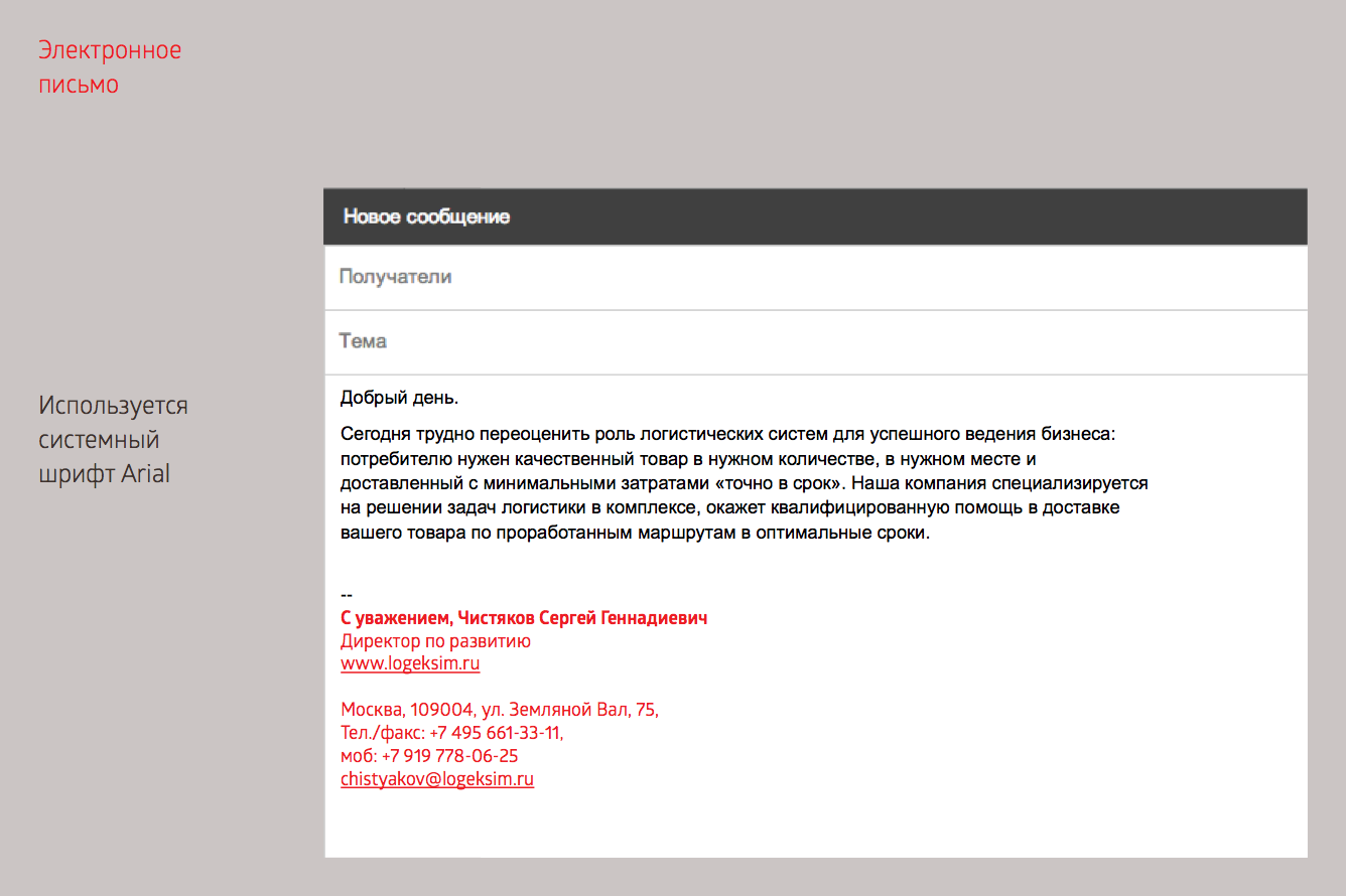
The rules of using the corporate style are collected in a guide. This guide describes the peculiar features of the two language versions, and includes the information about brand colors and fonts, recommendations on text layout, the list of unrecommended ways of use and examples:


The new site gives a clear vision of what Logeksim is now. We give examples of the tasks the company solves, describe the area of competence and business approach, speak about features and communication. All this helps to see the company as a reliable business with a professional and responsible team.
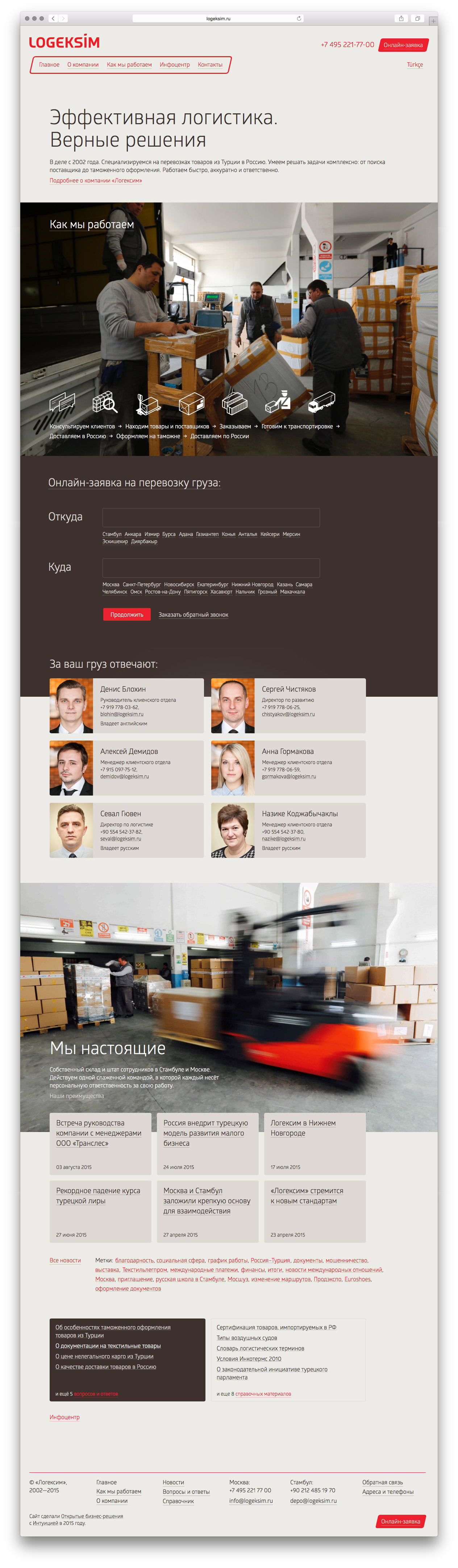
The new site is a result of working with the structure and meaning. We detected the most important idea, put it in simple words and made it easy to find. We collected news, guides and FAQs in a special information section. Created a story about work stages. And removed everything that was not necessary.
From the start of working on the project to the site launch we had: a dozen of skype calls; one meeting in person; three and a half logo drafts; the site design found in one try; discussing the smallest details with the client’s team; managing outsourced development; endless editing of news and guides and several lists of the “very last” corrections.
Created in collaboration with Open Business Solutions. The site managed by the client.