Park → DRUГ
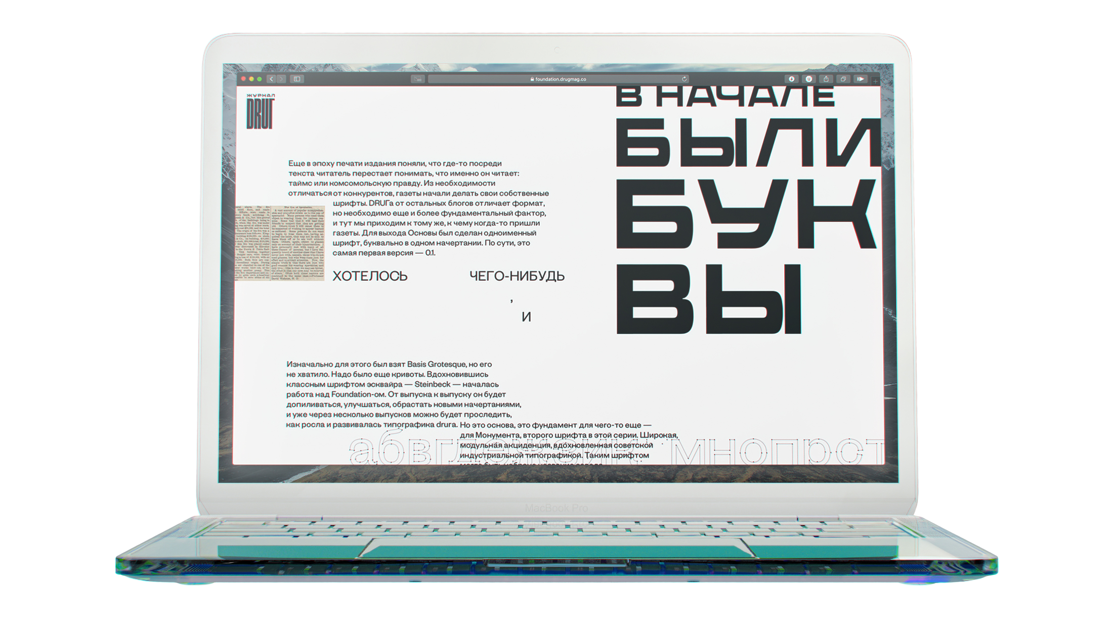
The name “DRUГ” is a pun, the word looks like “friend” in Russian and at the same time as “drug” in English. It is a magazine created by a designer for designers, an experimental and protesting project. When looking at online magazines you ask yourself: why do they all look like similar boring blogs in the time of the coolest web-technologies?
Any designer who has leafed over magazines with beautiful layout must be very sad about how magazines look in the internet. DRUГ changes these “standards” in layouts and typography.

For the first issue we have created two fonts: Monument and Osnova. Each of them was created in about a couple of evenings, so they look a bit rough and plain. As a result these “qualities” became the base for the issue.